By Alexander Wilson –
Warner Bros. and Discovery have merged forces, but the new logo for the venture is already being mocked online
The merger of Warner Bros. and Discovery will create one of the largest U.S. media companies. Discovery CEO David Zaslav, who is set to be the head of the newly formed Warner Bros. Discovery, announced the new name in a 45-minute town hall meeting.
CEO David Zaslav said in a press release:
”We love the new company’s name because it represents the combination of Warner Bros.′ fabled hundred year legacy of creative, authentic storytelling and taking bold risks to bring the most amazing stories to life, with Discovery’s global brand that has always stood brightly for integrity, innovation and inspiration,” CEO David Zaslav
Yes, it also is the the name of the two companies side by side.
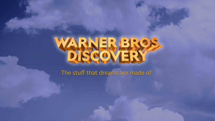
We have not even discussed the logo itself. For a media conglomerate claiming to be on the cutting edge of well–everything—the logo hearkens to ’90s graphic design. Like the name, it also represents a poorly smashed together rendition of the old Warner Bros. logo and the current Discovery logo.
“The stuff that dreams are made of” from the Maltese Falcon, spoken by Humphrey Bogart. It’s a reference to the Warner Bros. film legacy, which we get, but, come on. The “stuff” that dreams are made of? There was no better combination of six words?
It’s only fair to note that this is not the final rendition of the logo, and after a healthy dose of public criticism, hopefully they will return to the digital drawing board.
The new media company is the result of a $43 billion merger between Discovery and Warner Media, just three years after AT&T bought Time Warner. We truly cannot wait to have to pay for seven streaming services from the separate wings of one super colossal media company. Thank you media overlords, you are so good at ideas and names and design and stuff!
The orange logo that sits on a cloudy backdrop definitely looks like an homage to twentieth-century cinema, but for some people, the style isn’t sitting right.
Many were quick to criticize the new logo, which also features a quote from Maltese Falcon that was spoken by Humphrey Bogart: ‘The stuff that dreams are made of.’ It seems that people expected a better logo from the merger and were vocal with their criticisms and comparisons.
One commentator wrote, ‘It looks like a fake company from a Spy Kids movie,’ and gained more than 39,000 up votes on Reddit. Another added that as a professional graphic designer, the logo hurt their soul. They also went on to critique the finances involved in this merger and the fact that the grammar was still wrong. Evidently, a lot of people did not like the image.
Others noted the perceived lack of effort in the logo:
I’m just glad to see Hollywood embracing an austere vibe and obviously spending $0 dollars coming up with a name for the combination of Warner Bros. and Discovery while using a free clipart CD with Windows 95 to design the logo..
Speaking about the newly-merged company at the town meeting, Zalav said:
Warner Bros. Discovery will aspire to be the most innovative, exciting and fun place to tell stories in the world — that is what the company will be about.
The merger of Warner Bros. and Discovery will create one of the largest U.S. media companies. On the back of this union, Discovery CEO David Zaslav, who is set to be the head of the newly formed Warner Bros. Discovery, announced the new name in a 45-minute town hall meeting.
Many were quick to criticise the new logo, which also features a quote from Maltese Falcon that was spoken by Humphrey Bogart: ‘The stuff that dreams are made of.’ It seems that people expected a better logo from the merger and were vocal with their criticisms and comparisons.
One commenter wrote, ‘It looks like a fake company from a Spy Kids movie,’ and gained more than 39,000 up votes on Reddit. Another added that as a professional graphic designer, the logo hurt their soul. They also went on to critique the finances involved in this merger and the fact that the grammar was still wrong. Evidently, a lot of people did not like the image.
Others noted the perceived lack of effort in the logo:
I’m just glad to see Hollywood embracing an austere vibe and obviously spending $0 dollars coming up with a name for the combination of Warner Bros. and Discovery while using a free clipart CD with Windows 95 to design the logo.
Despite the jokes, this won’t be Waner Bros. Discovery’s final logo. Instead, the image is just of the ‘initial wordmark’ for the merger. This means that a more palatable logo should be seen when the merged company begins releasing media. At least, many will hope that a new logo improves on the initial design.
Speaking about the newly-merged company at the town meeting, Zalav said:
Warner Bros. Discovery will aspire to be the most innovative, exciting and fun place to tell stories in the world — that is what the company will be about.
We’re not coming in here thinking that we know all the answers. There is a ton we don’t know. And there’s certainly a whole bunch that you guys know a lot better than we do.


